Sizzler’s Rebrand Signals Fast Casual Dining Comeback
We're all GOIN’ SIZZLER with Tavern's rebrand for the West Coast icon, which is deeply rooted in the brand's nostalgic heritage.
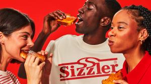
Recognizing that many Millennials grew up with fond memories of Sizzler, Tavern's rebranding strategy focuses on leveraging the brand's heritage to attract this demographic that feels the nostalgic pull of infinite salad bar trips and cheese toast. In fact, the death of fast-casual dining has been exaggerated 67% of Gen Z consumers favor it, while 57% of Millennials prefer it over quick-service options. By tapping into the sentimental value associated with the brand, Sizzler aims to compete with fast-food giants like McDonald's and offer a more appealing alternative for parents seeking a dining experience that evokes comfort and familiarity.
Over the years, Sizzler faced an identity crisis and lost its way. But what remained was its pop culture status and its sentimental, warm-and-fuzzy place in our collective memories. Teaming up with the restaurant chain's new management, Tavern, Sizzler's agency of record, set out to bring this California icon back and instill some of the brand's original magic.
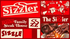
Reimagining the brand through the lens of modern heritage, Tavern made the steak house sizzle once again. By tapping into the restaurant’s rich history, the agency crafted a reimagined identity that blends timeless elements with modern design sensibilities. “For a brand with such a strong nostalgia factor, a sense of heritage was key to winning back the hearts of fans,” said Mike Perry, Founder and Creative Director of Tavern. “Tapping into the brand’s history in a meaningful way, the new identity system was built from a selection of heritage assets that were revived from the brand’s archives and refreshed to suit contemporary tastes.”
Tavern wisely recognized that they didn’t need to tweak much regarding the logo—instead, it was about repurposing an element that already had decades of equity. Refreshing the visual identity meant reimagining how those assets could be used across the entire 360-brand experience that enables endless creativity, injects variety into the brand, and inspires an array of creative executions.
Using the wordmark, they turned it into an actual cattle brand. What’s more, the classic sizzlin’ ZZ’s from the logo and the word “sizzle” itself (borrowed from a crispy, burnt 70’s logo) were repurposed as secondary assets that could dial up the playfulness and ownability of clever copy and menu item names.
Tavern also stripped away the gradient and used a rich burnt maroon color as the hero of the identity’s palette, emphasizing that, yes, this is a family steak house, and medium rare is still the proper way to order a New York Strip. A delightful, curling heritage typeface pulled from old in-store ephemera, a contemporary cut of the often used Windsor throughout the 60s and 70s by Sizzler, was paired with a more contemporary Block Berthold to add variety and punch up the identity.
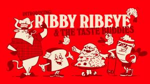
A forgotten cow mascot from the 1950s was brought back to life and renamed Ribby Ribeye. Ribby also has an entourage of new Taste Buddies like Rippy, the lobster tail, Toasty, the brand’s beloved cheese toast avatar, and the Salad Bar-barian. Sizzler’s popular menu inspired each character but has elements of 1950s Hanna-Barbera cartoons and mid-century Southern California.
The rebrand went beyond a fresh new look and feel, with the Tavern team reimagining Sizzler from the inside out. Behind the scenes, Tavern helped them overhaul their brand strategy, tone of voice, sonic branding, and product innovation and naming strategy. Even how servers greet customers was reconsidered and adapted for a new generation of Sizzler fans. Every detail has been thoughtfully redesigned and will be put into practice—from the restaurant interiors and menu boards to staff uniforms—as the remodeled restaurants roll out.
"We approached this project with an element of humility. It's difficult to build a brand with 60 years of equity that's so widely known and beloved," said Chris Perkins, President and CEO of Sizzler. "We focused on this idea of what made Sizzler great in the first place. And while we looked back at all these wonderful and iconic things from the brand's past, we made it relevant for today's customers and created a fresh, inviting experience for families."
“We wanted to create a brand that resonates with longtime fans and a new generation of diners,” added Perry. “By combining the best of Sizzler’s heritage with a modern aesthetic, we’ve revitalized a brand that isn’t just nostalgic, it’s joyful and exciting, and it casts the brand in a new, timeless light.”
With its refreshed brand identity, Sizzler is poised to reclaim its place as the beloved darling of fast casual. The restaurant chain invites customers to experience the new Sizzler, rediscover the joy of family-style dining, and put a little of that Sizzler magic into the little things.
Jessica Deseo
Coolwish
jessica@coolwish.co
Sizzler Rebrand
Distribution channels: Consumer Goods, Culture, Society & Lifestyle, Food & Beverage Industry, Media, Advertising & PR, Social Media
Legal Disclaimer:
EIN Presswire provides this news content "as is" without warranty of any kind. We do not accept any responsibility or liability for the accuracy, content, images, videos, licenses, completeness, legality, or reliability of the information contained in this article. If you have any complaints or copyright issues related to this article, kindly contact the author above.
Submit your press release


