

Logo designing is an art. Yes! It is true that logo plays a very important role in websites and blogs. But, more often than not, we forget that it needs to be simple and catchy. If you design an elegant logo and write down an amazing content then it is sure to draw in audiences to your blogs and websites. Try and implement these astounding factors and let us know if you have got some new ideas.
Are you a new blogger concerned about logo designing? If yes! Then dig into this blog and get to know why you should.
Are you planning a website for your start-up and hiring a graphic designer? If yes… then read this piece of information first.
It has been observed that many of the start-ups and fresh bloggers spend hours designing fancy designs. We know it is an important feature to create an effective website.
We also agree with the fact that a fancy logo attracts a bunch of audiences. But what if after sometime traffic on your website gets reduced? And what if after spending dollars on the fancy logo you are not able to get the expected result? It will become worthless in the end, isn’t it?
Many of us are not aware of the types of logo designs, before creating one. Every other website owner just hires a graphics developer or buys a heavy tool for designing a fancy logo. First, let us study about various categorized logo designs.
Types of Logo Designs….
- Wordmarks logo
- Lettermarks (Monogram) logo
- Pictorial Marks logo
- Abstract logo marks
- Mascots
- The Emblem
- The Combination Mark
These types of logos are already implemented by renowned companies, let us study in brief what features they hold.
Wordmarks Logo:
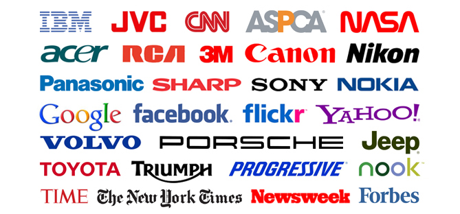
Well, you might have seen the famous logos of brands like Google, Coca Cola, Disney, and many more. Watermarks logo are implemented by these popularly known companies. Now, what exactly is it? It is a font-based logo and the best thing is, it focuses on the brand name.
Lettermarks Logo (Monogram):
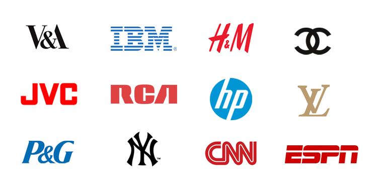
Lettermarks are often called as Monogram logos. These kinds of logo basically follow a pattern. Lettermarks actually takes a few initials of the company names and with dramatic patterns, a logo is designed. We have already observed these monogrammatic logos in brands like Facebook, IBM, HBO, etc.
Also, these logos are multipurpose for the companies to print on their business cards. It behaves like a theme for the brands’ webpages. Thus, you need to choose your initials very carefully, to make it look decent and clear.
Pictorial Marks Logo:
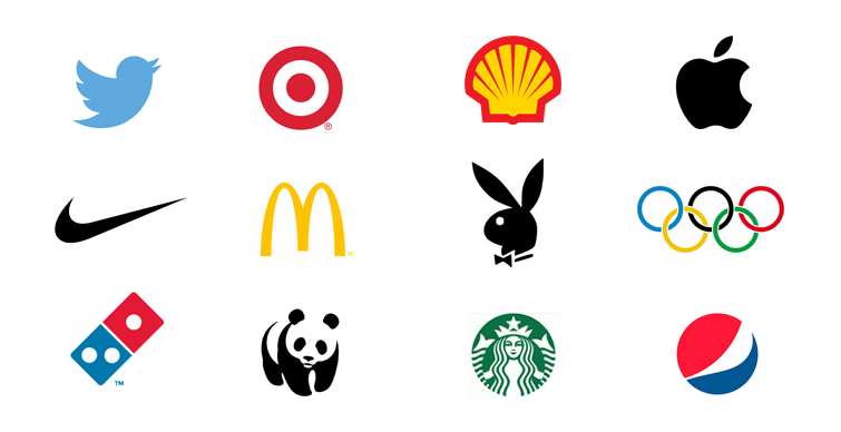
Pictorial marks are often known as brand logo or logo symbol. Basically, these are the logo with an iconic symbol or graphical picture as a symbol. When it comes to designing a pictorial brand symbol, we should choose a clean graphical image to justify the brand name. With a few brand names like Apple, Twitter, Snapchat, Instagram, etc, we can conclude that image is a true brand name.
Abstract Logo Marks:
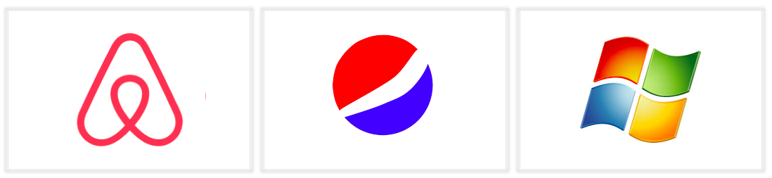
An abstract logo is one of the most catchy symbol designs just like a pictorial logo. The only difference in these logos is abstract logo marks are designed geometrically. Various colors and changes in the forms represent the emotions and illustrate the meaning of brands.
The best thing about an abstract logo is, it gives us an independent way to modify the geometrically designed graphical images to customize. Famous brand names which have abstract logo marks are Pepsi, Adidas, Windows, etc.
Mascots:
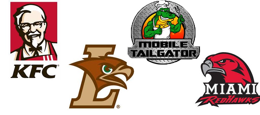
Have you observed food-related logos? If yes! Then you are right they mostly consist of mascots. Mascots are the most appealing and attractive type of logos. These include cartoonish, often colorful, and some characters. These symbols are so engaging that the characters of the logo directly interact with the observer.
Especially the food-based companies have such kind of symbols or logos.
Mascots are used by KFC, Mr. Peanut, McDonald's, Pizza Hut, Hamms, Chocos, etc.
The Emblem :
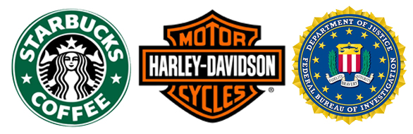
The emblem includes a combination of text with stylish font, symbol, picture or an icon. Think about badges, seals, and crust of government office, schools or colleges. The Emblem gives a traditional, stylish and classic look to the brand name.
Logos like Starbucks, Harvard University, Harley Davidson, and many more which has a classic look comes under the Emblem.
The best thing about emblem mark is it cannot be replicated easily. Also, these logos are mostly used for embroidery work for customizing t-shirts But few drawbacks of these symbols are they are time-consuming and cannot be printed on the visiting cards.
The Combination Mark :
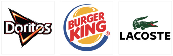
Have you seen the logos with the right combo of pictures, symbols, and extremely catchy fonts?
The combination mark is a logotype which is very fancy. It is an amalgamation of all types of logos. There are no strict rules and regulations to design combination logo. You can keep fonts at the top of the
symbol or in the mid of the picture and keep it symmetric too.
Few top known brands who have used the combination mark are Burger King, Lacoste, Dominos, etc.
The best thing about combination logo is you can your type of creative. You can relate your brand name with the logo and let people recognize you at a glance! Make sure it doesn’t turn up to be clumsy at the end.
It looks like covering about logotypes has cleared the vision and doubts regarding creating a fancy logo. Now you will know what logo will fit with your blog or company name.
But few of you unknowingly make mistakes while designing them. Let us figure out what are they?
Logo Designing Mistakes …
- Choosing poor font
- Unnecessary usage of animation
- Plagiarizing the monograms
- Putting too many visual effects
- Using heavy tools which turns the designing complicated.
- Invest an excessive amount of money by hiring graphic designers.
Do you make any of them? Let us continue with some easy techniques to design logo avoiding mistakes.
7 Time - Saving Tips to Follow while Logo Making
Hey! Now you can also design your own logo without spending too much time and money. These are the seven pointers that you need to grasp.
- Understanding brand
The first very essential thing before being creative with the logo is knowing your brand. This thing happens with even large organizations as they forget what their company or brand represents. You might have observed that most of the popular brands have a very simple and unique logo. Just look at the logo of Facebook, it has lettermark “f” representing facebook which connects you with people globally.
- Selection of an engaging font
The font of any logo has a different significance. But, make sure it is readable. Don’t use complicated fonts. It should match with your brand. Whatever you do, don’t make the font very light or shady. Keep it accurate and clear. We know everyone wants to modify the font according to their choice but forget about the color. The color of the font should not be very light and dim.
Also while following all the mentioned rules, do not forget to be meaningful. Text or title having more than two words should look clean, not messed up or overwritten.
- Using quality pictures
When you are creating a logo, it is obvious to use graphical images, shapes, cartoonish characters, icons, etc. But the quality of the pictures is always a concern. While making a logo, always ensure to use pictures of good pixels with accurate size. Also, try to customize that picture smartly.
Note: There is no need to buy pictures from any website. Use stock images whenever possible.
- Remember about scalability
This is a very important point to remember. When you make a logo, always plan about the scalability. You might be thinking, how does the word ‘scalability’ relate to logo making? When you are creating a brand logo make sure the logo fits to print on business cards, hoarding, on the shirt (emblem for t-shirts), etc. The logo’s picture should not get burst or twirl.
- Pay attention to geometry
It is quite effective to design the logo of your choice. While designing a picture logo you need to take care of the geometry. Just take an example of a Twitter bird. The twitter bird looks very simple but it has been designed using geometry. With the help of geometry, it is possible to maintain the scalability and shape of the logo design. It also gives a proper structure to the logo.
By doing this, you will also be able to improve the scalability factor.
- The right mixture of simplicity and elegance!
People often get confused when they design mascots or combination designs. They mix up every font and vibrant colors all together to make it look catchy. But in the end, the logo design gets messed up.
To avoid such situations try to bring some simplicity in the logo. Always make sure that the font and the picture of the logo resemble with each other. It should look decent and elegant in such a way that the audience remembers your brand at a single glance.
- Try to ignore the cliche
Since you are sure that you are going to design a unique symbol for concluding the logo, don’t use a cliche. You should know that your logo will get some visual cliche. Don’t get confused and compare any other logo with yours.
News From
 Elsner Technologies Pvt. Ltd.
Category: Web Design & Development Profile: Elsner Technologies is an enterprise web and digital marketing agency that has carved a niche for itself by offering innovative, logical, and highly responsive web and IT solutions. Our highly talented bunch of employees always strive hard to raise our bar in terms of services provided to our clients with utmost dedication. We believe in the work hard, party harder principle. For more details visit us at https://www.elsner.com/
For more information:
Make an Inquiry about this report HERE!- www.elsner.com/service…evelopment
- www.elsner.com/service…o-services


